Instagram Carousel Examples with Slide-By-Slide Copy
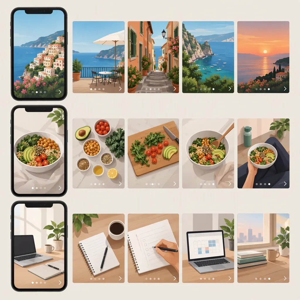
An Instagram carousel example can be a short tutorial, a before-and-after reveal, or a comparison that unfolds across several slides. Below are three original five-slide concepts with complete copy, captions, and visual directions. They are illustrative drafts—not published posts or evidence of performance. For public inspiration, Glorify describes recipe sequences, product-detail posts, and an illustration progressing from sketch to digital artwork. [c2]
Public Examples and What to Borrow
Look beyond the cover and study what changes with each swipe. Glorify’s January 2023 collection describes several useful patterns: [c2]
- A finished result followed by a process: Its Williams Sonoma example begins with a food image and continues through preparation.
- An overview followed by details: Its Vera Wang example starts with video and follows with detail images.
- A transformation: Its Damppstudio example traces an illustration from pencil sketch to digital artwork.
Borrow the sequence rather than another creator’s images, wording, or visual identity. For example, a process post can move from finished result to materials, stages, and a final recap.
Hootsuite’s carousel-ad article also recommends a clear beginning, middle, and end, including step-by-step tutorials as one possible structure. That source concerns paid advertising; its ad specifications should not be treated as current organic-post specifications. [c1]
The concepts below are original educational examples inspired by these broad structures. Neither source verifies their performance.
Example 1: A Mini Tutorial
Concept: A five-slide carousel about organizing a desk into functional zones.
Creative direction: Use a simple overhead desk illustration. Keep the same viewpoint throughout, adding one highlighted zone on each middle slide. The cover shows the complete arrangement; the final slide reduces it to a diagram.
Why this sequence fits: The cover names the task, the middle slides explain three choices, and the ending restates the system. Each swipe adds a distinct instruction rather than another version of the headline.
This is an original storyboard, not a claim that a particular desk arrangement improves productivity.
Five-Slide Desk Tutorial and Caption
**Slide 1 — Cover**
A desk setup with a place for each task
Three zones: working, reaching, storing.

**Slide 2 — Working Zone**
Start with the space directly in front of you.
Place the tools for your current task here. Leave room for the work itself.

**Slide 3 — Reaching Zone**
Choose what belongs within reach.
Keep frequently used items nearby without filling the center of the desk.

**Slide 4 — Storage Zone**
Give occasional-use items another home.
Use a drawer, shelf, or container for supplies you do not need for this task.

**Slide 5 — Recap**
Working: what you need now.
Reaching: what you use often.
Storing: what you use occasionally.
Your layout can change when your task changes.

**Caption**
This example divides a desk by use rather than appearance. The same object might belong in different zones for drawing, writing, or video calls. The aim is a layout that matches the task—not a perfectly empty desk.
Example 2: A Before-And-After Reveal
Concept: Show how a crowded event notice becomes a clearer information layout.
Creative direction: Use a fictional poster with identical information in the before and after versions. Mark the first version as “Illustrative Draft.” Highlight only the element being changed on each middle slide.
Sequence: Original layout → competing elements → grouped details → revised hierarchy → side-by-side recap.
Keeping the underlying information unchanged makes this a design demonstration rather than a supposed customer result. Avoid attaching invented attendance, engagement, or conversion figures to the reveal.
Five-Slide Poster Redesign and Caption
**Slide 1 — Cover**
Same event details. A different layout.
An illustrative poster redesign, step by step.

**Slide 2 — The Starting Point**
Everything is asking for attention.
The title, date, location, and extra notes all use similar size and emphasis.

**Slide 3 — Group Related Details**
Put the practical information together.
Date: Saturday, June 12.
Time: 10 a.m.–noon.
Location: Community Studio.
These details are fictional placeholders.

**Slide 4 — Set the Reading Order**
First: what the event is.
Second: when and where it happens.
Third: what participants should bring.
Use size and spacing to express that order.

**Slide 5 — Before and After**
The information stayed the same.
The arrangement changed.
Compare the title, the details block, and the space between them.

**Caption**
This fictional poster demonstrates grouping and visual hierarchy. It is not a real event announcement or a measured case study. The redesign keeps the content constant so the layout changes are easy to inspect.
Example 3: A Choose-By-Situation Comparison
Concept: Compare a handwritten notebook with a digital note for everyday planning without declaring a universal winner.
Creative direction: Use two stable columns labeled “Paper” and “Digital.” Give both options equal visual weight. End with situations rather than a score or ranking.
Sequence: Decision → paper option → digital option → selection questions → conditional conclusion.
The copy below presents practical choices, not claims about memory, learning, or productivity. Any software-specific features should be checked separately before replacing the generic digital-note example with a named app.
Five-Slide Planning Comparison and Caption
**Slide 1 — Cover**
Paper or digital for your daily plan?
Choose around the way you will use it.

**Slide 2 — The Paper Option**
One page for the day.
Write your tasks, leave room for notes, and keep the notebook where you plan to use it.

**Slide 3 — The Digital Option**
One note for the day.
List your tasks in a note you can edit on your device. Keep the structure simple.

**Slide 4 — Ask Three Questions**
Where will I check this plan?
How often will I change it?
What will I actually keep using?

**Slide 5 — Choose by Situation**
Choose paper if you want a physical page beside you.
Choose digital if you want to revise a note on your device.
Use both only if each has a distinct purpose.

**Caption**
This comparison is about fit, not a universal best method. A useful daily plan is one you can find, update, and understand. The format is a choice; the tasks are the content.
Give Each Example a Cohesive Finish
For these drafts, use one heading style, one body-text style, and a consistent place for slide numbers. Change the illustration when the idea changes, but keep the reading order recognizable.
Glorify recommends consistent colors, fonts, or templates and cautions against putting all the information on the first image. It also discusses captions and descriptions as accessibility considerations. [c2]
Before treating a draft as finished:
- Read the slides in order without the caption. Does the sequence make sense?
- Remove any slide that merely repeats the cover.
- Preview the design at phone size and simplify text that feels crowded.
- Keep essential words away from decorative slide-edge effects.
- Describe meaningful visual information in accompanying accessible text, and caption any spoken video content.
- End with the promised explanation or recap—not an unrelated promotional message.
Five slides are a creative constraint for these examples, not a platform maximum or a proven ideal length.
FAQ
What Is the Difference Between a Carousel Example and a Template?
An example shows a complete content sequence: what the cover says, how the middle slides develop it, and where it ends. A template supplies a reusable layout. The three concepts here include finished draft copy so you can evaluate the sequence before choosing a layout.
Does an Instagram Carousel Need Five Slides?
No. These examples use five slides to keep each concept compact. That count is not a platform requirement or a performance recommendation. Add a slide when it contributes a necessary step, example, or contrast; remove it when it repeats another slide.
Are These Examples Real Published Instagram Posts?
No. The slide copy and captions are original illustrative drafts. The separate public-inspiration section summarizes examples described by Glorify, while Hootsuite provides an advertising-focused storytelling reference. Neither source establishes results for the original drafts. [c1] [c2]