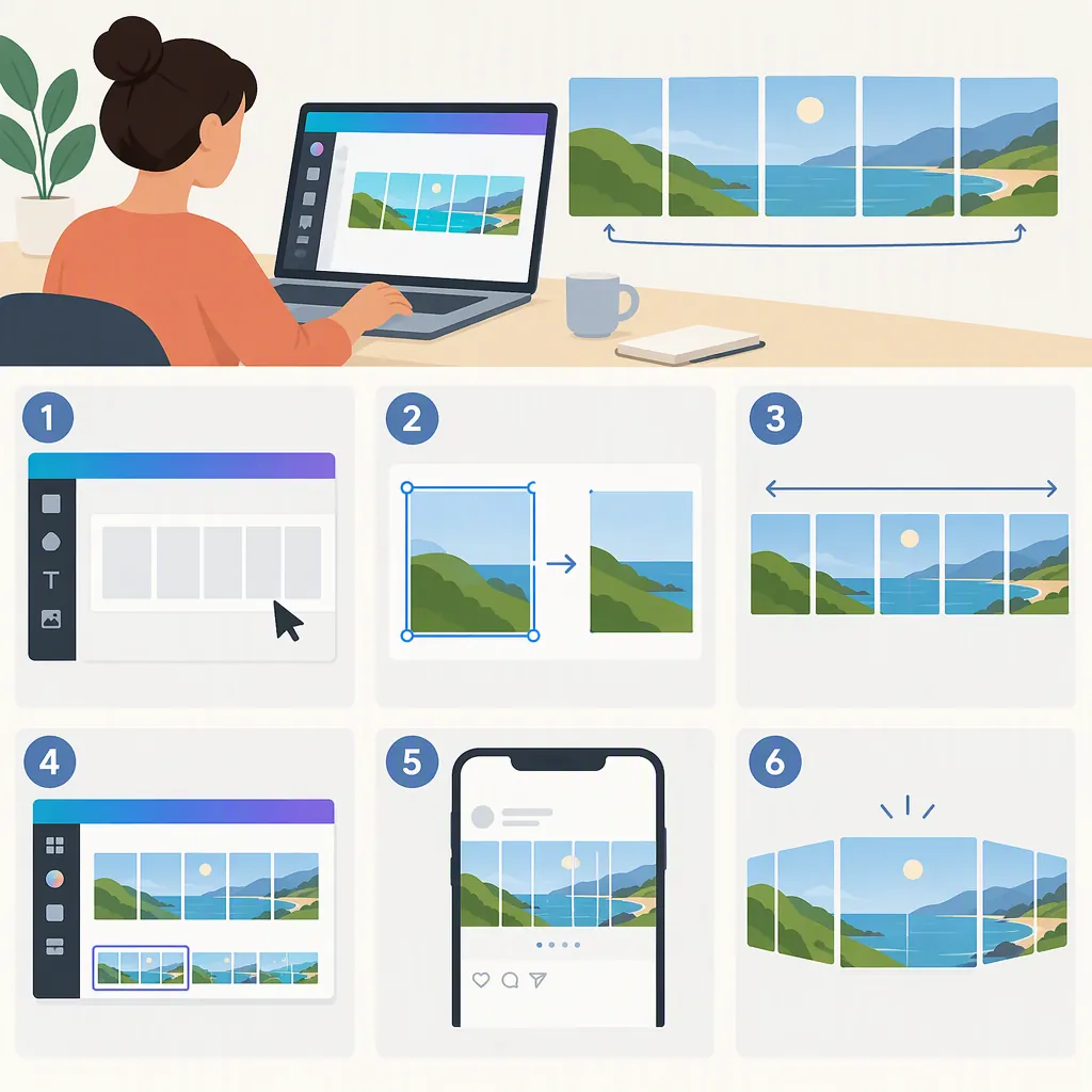
How to Create a Seamless Carousel in Canva
To create a seamless carousel in Canva, design one wide canvas, mark equal-width slide boundaries, and place selected graphics across those boundaries. Then export the full image and use a separate image splitter to produce individual slides. For a five-slide portrait example, the supplied tutorials use a 5400 × 1350 px canvas divided into five 1080 × 1350 px panels. [c1] [c2]
1. Set the Canvas Dimensions
A seamless carousel starts as one continuous composition rather than several independently designed pages. The supplied Canva tutorials describe designing the full strip first and cutting it into slides afterward. [c1] [c2]
In Canva, choose Custom Size and enter dimensions in pixels. For the formats used in these tutorials:
- Square panels: total width = 1080 × slide count; height = 1080.
- Portrait panels: total width = 1080 × slide count; height = 1350.
For example, five portrait slides require 5400 × 1350 px. Three portrait slides require 3240 × 1350 px. These are worked design examples, not a complete statement of Instagram’s current supported formats. [c1]
Check that Canva accepts your intended canvas size before building the layout. Scott Social’s tutorial reports an 8000 px width limit, but the supplied material does not establish whether that limit remains current. [c2]
Five-Slide Portrait Layout Specification
Canvas: 5400 × 1350 px
Slide count: 5
Panel size: 1080 × 1350 px
Internal boundaries: x = 1080, 2160, 3240, 4320 px
Final panel order: left to right
2. Mark Every Slide Boundary
Guides show where the exported image will be cut. Scott Social describes opening File > View Settings > Show rulers and guides, then choosing Add guides > Custom, setting the column count to the number of slides, and setting the gap to zero. Canva’s interface labels may differ from those shown in the tutorial. [c2]
The other supplied tutorial describes dragging vertical guides from the ruler at every 1080 px interval. For the five-slide example, place internal guides at 1080, 2160, 3240, and 4320 px. [c1]
Treat these lines as cut boundaries, not decorative spacing. A useful layout check is to confirm that each panel occupies the same width before placing detailed content.
3. Design Across the Seams
Place a background, shape, photograph, or illustration across a guide so that it continues from one panel to the next. Both tutorials describe crossing slide boundaries with visual elements as the basis of the seamless effect. [c1] [c2]
For a readable layout, use these design checks:
- Keep essential sentences within a single panel rather than splitting words across a seam.
- Let decorative elements cross boundaries while keeping the main message understandable on each slide.
- Keep faces away from the cut line; Scott Social specifically recommends leaving most of a person’s image on one slide. [c2]
- Use the last panel to finish the explanation rather than leaving an essential point incomplete.
These are layout recommendations, not promises of increased reach or engagement. A continuous composition should still make sense when a viewer pauses on an individual slide.
4. Export and Split the Full Image
Export the entire wide composition as one image. Scott Social’s tutorial uses PNG for this step. Then split the image into the same number of equal-width panels used in your design. [c2]
The supplied tutorials use separate tools for cutting: My Social Boutique describes its Instagram Grid Maker with the column count set to the slide count and Image Cut set to Carousel; Scott Social describes PineTools’ Split Image workflow. These are external splitting tools, not Canva features. [c1] [c2]
Whatever splitter you use, check its preview rather than relying only on a direction label. The result should be one row of panels cut from left to right—not several horizontal bands stacked vertically. For the five-slide example, each output should measure 1080 × 1350 px.
5. Check Continuity Before Publishing
Review the split images in left-to-right order before uploading them as a carousel, as described in the supplied workflow. [c1]
As a practical check, place neighboring outputs side by side at the same display size. A line or photograph crossing their shared edge should continue without a jump. If it does not, inspect the panel order, crop dimensions, and whether the splitter added spacing.
Inspect the upload preview too. If the preview crops a panel differently, the visible seam may no longer match. The supplied material does not verify the current Instagram crop controls or slide-count limit, so this article does not prescribe a specific current button or maximum slide count.
Seamless Carousel Review Checklist
- Confirm that every output has identical dimensions.
- Arrange panels in their original left-to-right order.
- Compare both sides of each shared seam.
- Check for added borders, gaps, or unexpected crops.
- Read each panel separately for clarity.
- Inspect the upload preview for consistent framing before publishing.
FAQ
What Makes a Canva Carousel Seamless?
Visual elements continue across adjacent slide edges. The supplied tutorials achieve this by designing one wide image in Canva and then dividing it into equal panels, rather than aligning each slide independently. [c1] [c2]
What Size Should a Five-Slide Canva Carousel Be?
Using the supplied tutorials’ 1080 px panel width, a five-slide canvas is 5400 × 1080 px for square panels or 5400 × 1350 px for portrait panels. The resulting slides are 1080 × 1080 px or 1080 × 1350 px respectively. [c1]
Do These Tutorials Split the Carousel Inside Canva?
No. They use Canva to design the continuous image, then use a separate image splitter to create the individual slides. This describes the supplied workflows; it does not establish whether other Canva export or splitting options are currently available. [c1] [c2]
Should Text Cross the Slide Boundaries?
For readability, keep essential words and sentences inside individual panels and use backgrounds or decorative shapes for continuity. Scott Social recommends minimal, clear text and using visual elements across the guides. The text-placement advice here is a design recommendation, not a Canva requirement. [c2]